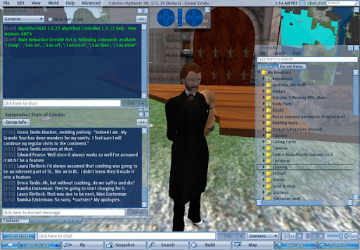
Despite literally thousands of Jira posts and requests, I don't ever remember hearing people clamouring for a more hideous colour scheme.
Yes the last one was shades of grey, but it didn't distract you from the viewer window and let you concentrate on the surrounds.

This new "Dazzle" Client Release is jarring in it's colour scheme and managed to crash me twice within 10 minutes of logging on. I hadn't even left the sim yet!


9 comments:
It looks like a fine chat background, if you miss typing on an Atari 800XL...
I do believe that I shall hold onto my old client for a bit longer then as all that I can say is...my dear God
I should blog about this, but, what does this have to do with our in world activities? I mean, Windlight serves a purpose. To a certain degree, but I'm still against this, Voice serves a purpose in Second Life. Dazzle.....serves no purpose whatsoever. Least what they could do is like with Winamp, and you, the resident, gets to choose the skin (I once had a Charisma Carpenter skin on my winamp player on my first computer).
The chat background, I will admit, I like. But, still, serves no purpose for me inworld whatsoever. Least they could do is help me out and fix The Grid to where I'm not redmapping once or twice during a Steelhead event (Thank God, the music keeps playing....least from what I'm told by a few residents).....Ok, maybe that's a Vista problem. I should get more RAM, but the Dazzle client will still look hideous.
Not on Dazzle, but did sit via chat with someone who was designing a new Dazzle skin. Should be interesting, that at least--that people *can*, should they wish, redesign the client.
I'm still struggling with the 'official' client, after many peaceful months on Nicholaz; I don't like it, I don't want to be on it, and even with the new graphics card, I *still* can't get the full effects of Windlight--if I want to move at all, I can't have anything atmospheric on, period.
Yes, now I have pretty water. Nifty. I'd prefer better system functionality, thanks.
From what I read about this new Dazzle thing it's supposed to eventually allow you to "skin" the client, though it wasn't going to allow it at the moment. Of course I've since been pointed at two places that have patches to give you back a less dazzling client.
Some of the improvements since I started SL have been great: flexiprims, sculpties, seemingly less alpha clashes. Some have been mildly interesting, like voice, and many like this are downright pointless.
I think the Nicholaz client is the equivalent of the 1.18.5 or something? This one's 1.20.0 (though there may already be a patch). They'd also diddled the camera tracking which I'm finding annoying. I might just go back to 1.19.
The name Dazzle always makes me think of the lyrics from Chicago, which I'm sure they did NOT intend:
Give 'em the old hocus pocus
Bead and feather 'em
How can they see with sequins in their eyes?
What if your hinges all are rusting?
What if, in fact, you're just disgusting?
Razzle dazzle 'em
And they;ll never catch wise!
Edward: so, essentially, 1.20 sucked, and 1.21 is the apology? When they should've stuck with 1.19 in the first place?
Merlot: HEE! But if the shoe fits...and some days, it really really seems to.
I started playing with beta versions of the Viewer when I upgraded my graphics card and found that the nvidia drivers were broken such that it was actually a downgrade: however this was worked around in the Windlight viewer, so I started using it. I actually like Windlight, even on my machines with less exciting graphics capabilities.
I am now messing with beta versions again because they support the Space Navigator, which I like a lot. However that has also given me Dazzle, which I am not especially enamoured of for the reasons described by others.
Ideally I would like to pull all these windows out of the main window altogether (I have two screens) but nobody seems to have thought of that possibility.
At least you can skin the Viewer to look much like it used to, and of course if you can create skins to have it look as you wish, how much the originators mess it up when they should be fixing things that still don't work properly won't matter so much.
Post a Comment